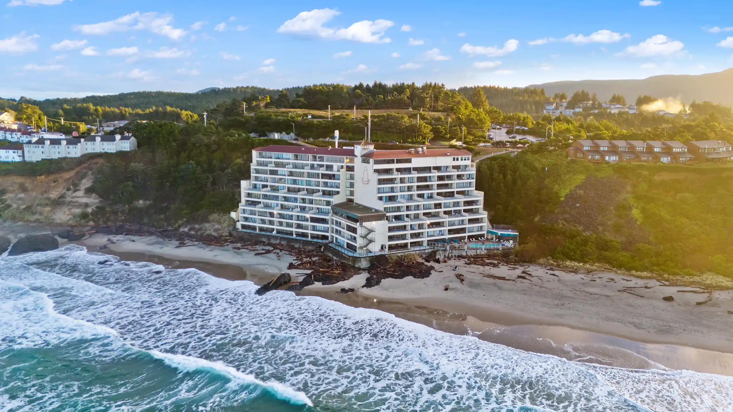
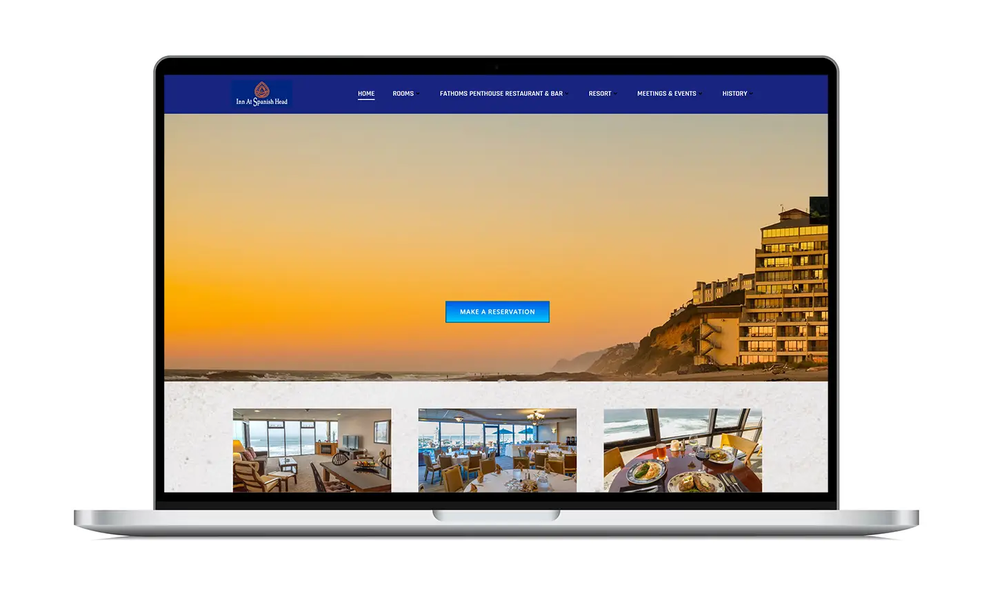
A seaside resort uniquely positioned on the sand, The Inn At Spanish Head has been a popular location for vacationers, weddings, and business meetings since 1969. While one of its charms is the historical sense of nostalgia the resort evokes, in recent years the resort had been struggling to attract new guests and younger audiences. It was time to modernize their website to align with the hospitality industry standard, and gain a competitive edge against other local resorts.
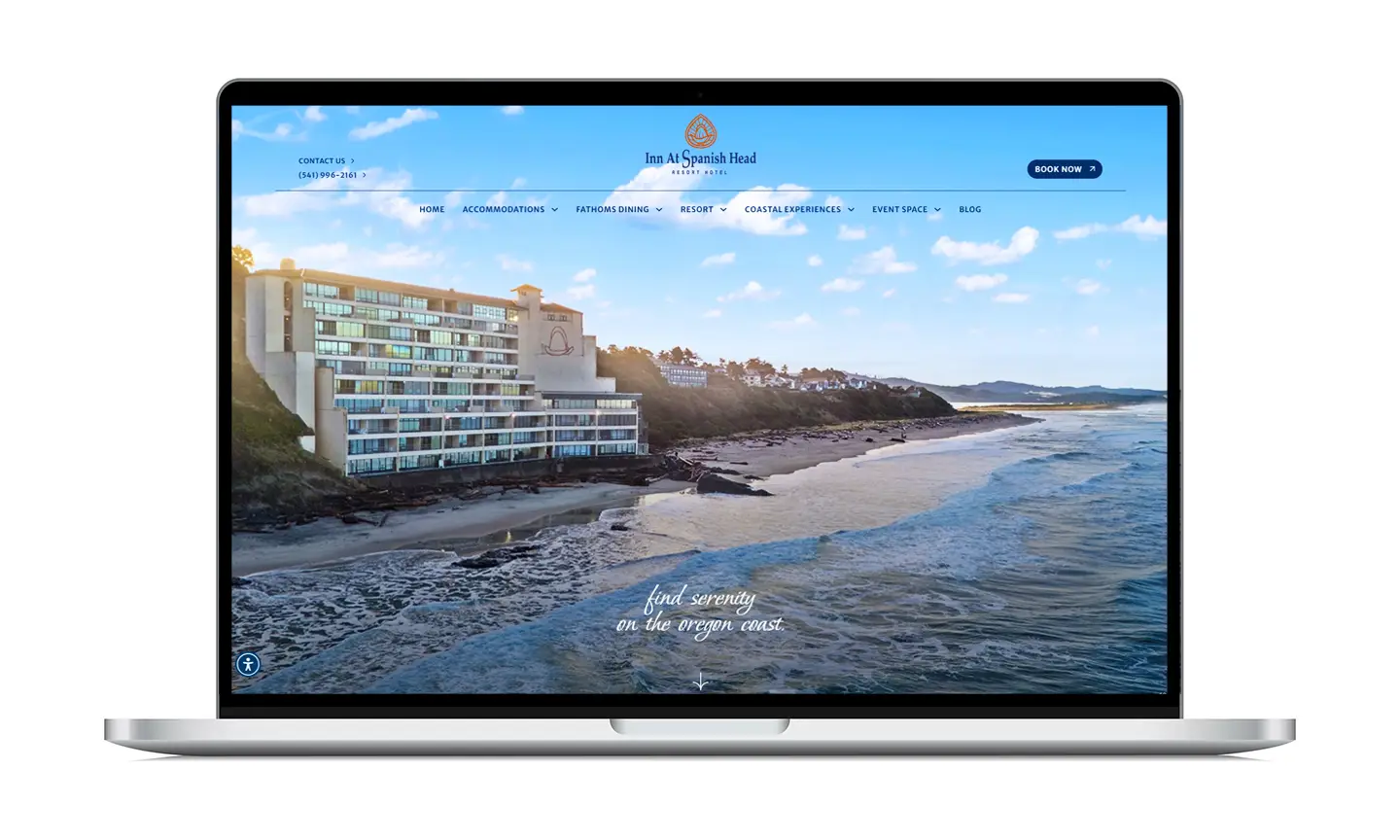
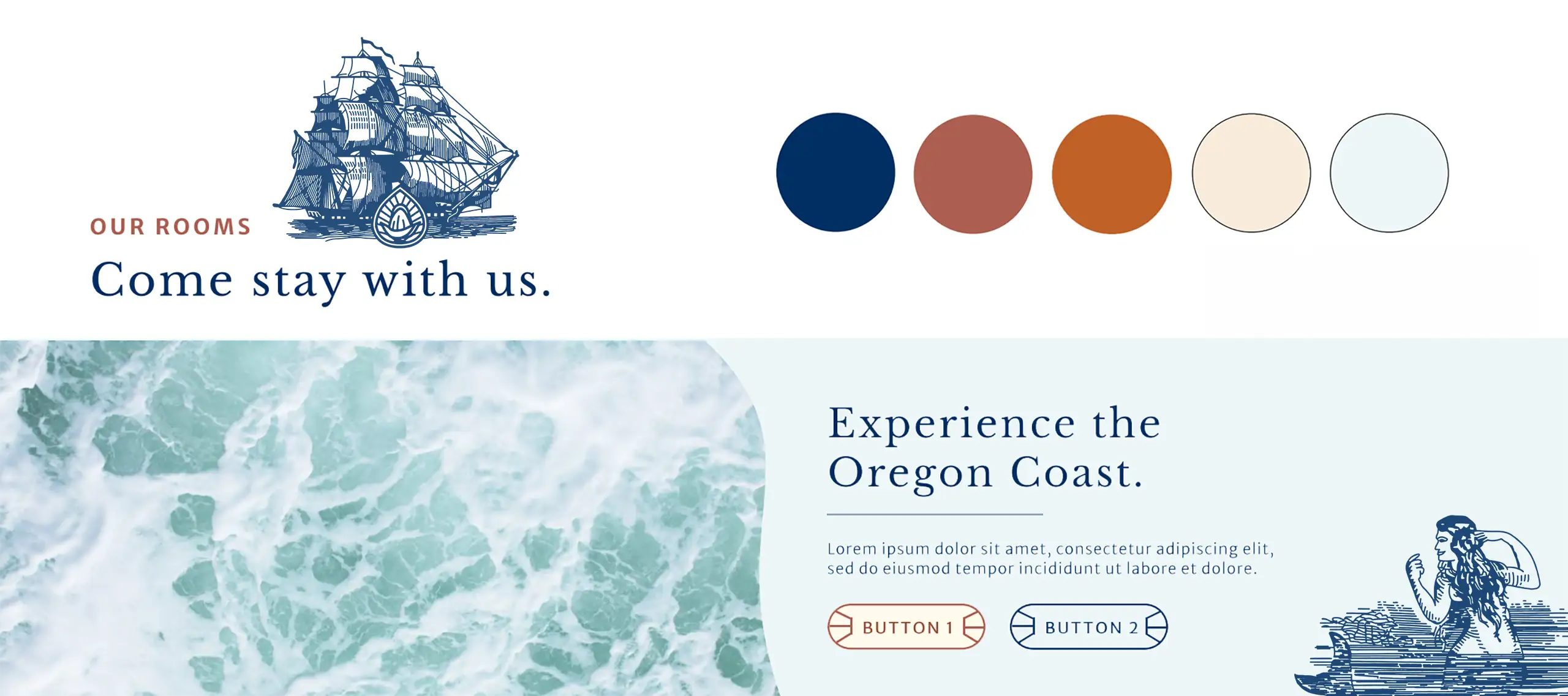
The Inn At Spanish Head’s sense of self is deeply entwined with it's location and the architecture of the building itself. As lead graphic designer, I worked closely with the IASH team to develop a brand identity that captured the timeless beauty of the resort and the escapism guests seek at the Oregon Coast. Stepping into the building, one is transported to 1960’s Spain - you’ll find a terracotta roof, cream stucco walls, elegantly arching entryways, and decorative tiled floors. It felt only natural that the Inn’s branding and web design is reflective of this experience, giving potential guests a taste of what their stay at the resort would be like.
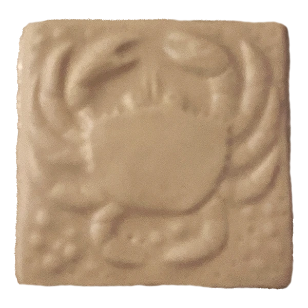
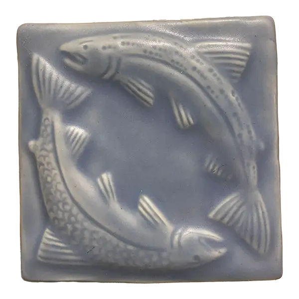
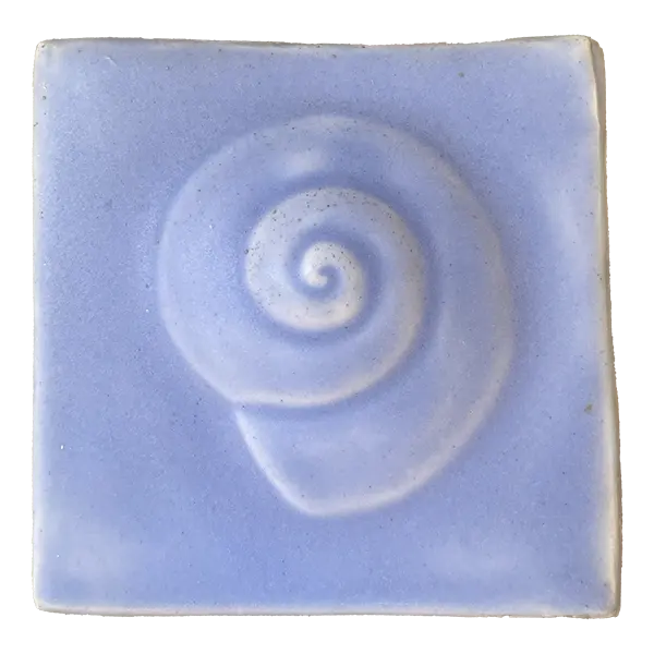
A unique, sea-inspired tile greets guests outside the door to their suite, accompanying every room number. It's little accents like this that make staying at the Inn a special experience, and I felt a pull towards incorporating them into the website. Ultimately, the tiles were outlined in Adobe Illustrator, with some small adjustments, and made into a pattern that serves as a background for text sections throughout the site. The pattern adds visual intrigue into otherwise simple areas on the site.