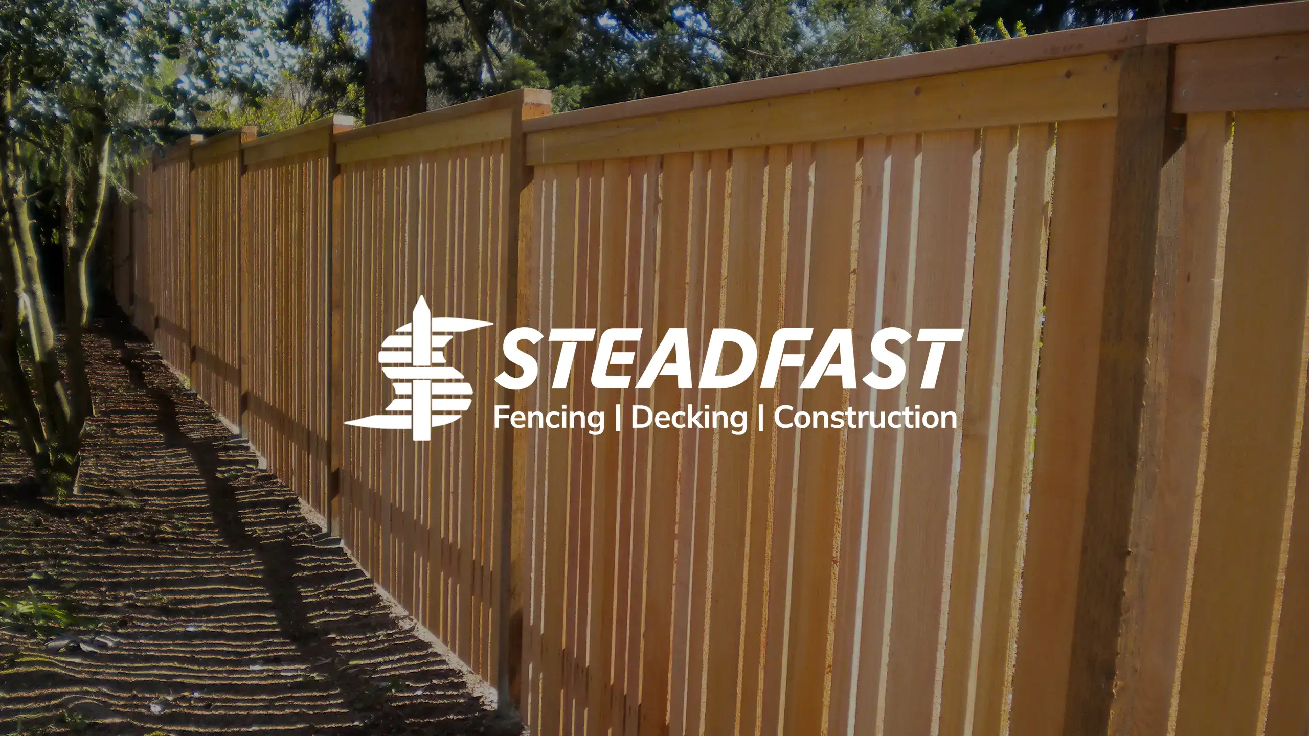
Our client had over 20 years of contracting experience, but found himself starting from scratch when he branched out to create his own business. As we got to know Ben, we were struck by his steadfast committment to integrity, quality, and customer satisfaction. These values became paramount to Steadfast's visual brand identity.
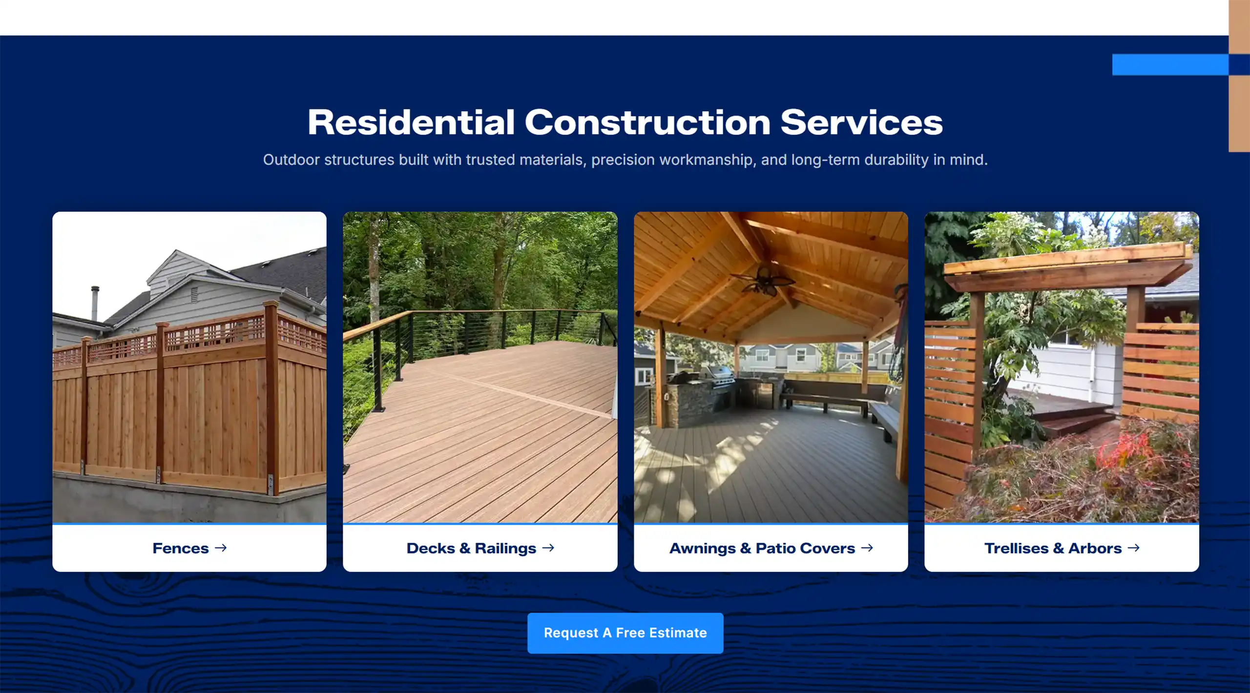
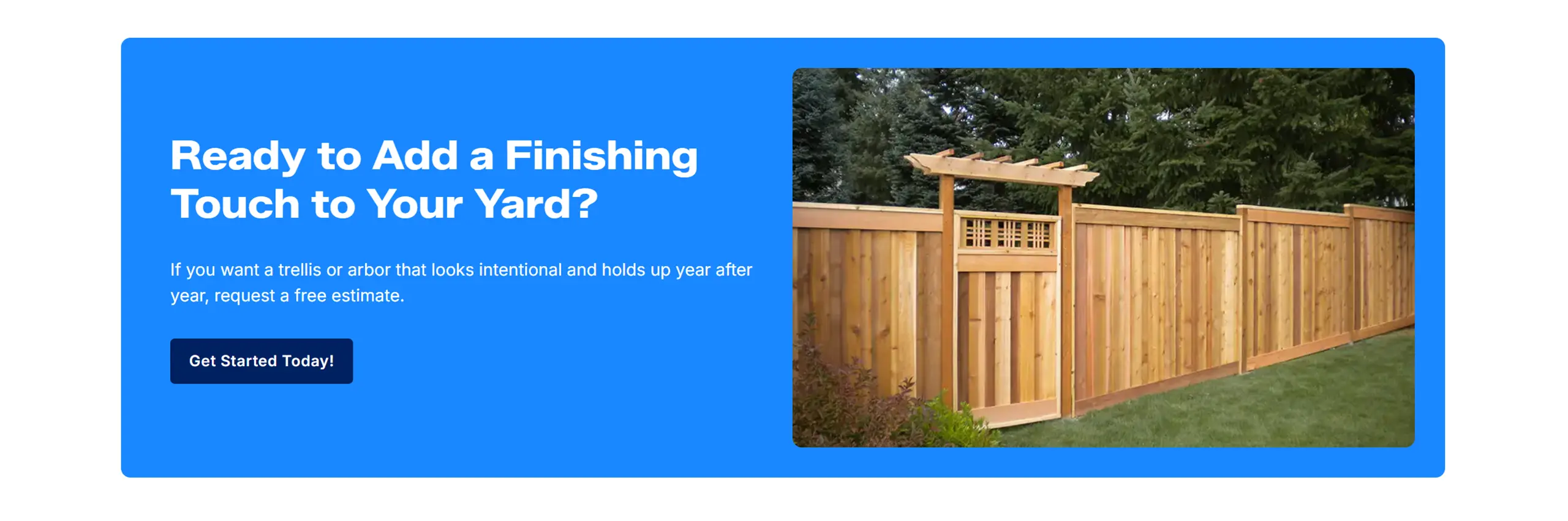
Overall, I wanted the website to capture Ben's inviting and friendly approach to his client interactions while conveying a sense of confidence in his abilities. The bright blue paired with navy marries this dichotomy perfectly. This cooler color palette truly makes the images of Ben's work (often warm-toned wood) pop. The very slight curve of button and image corners, as opposed to a completely rounded alternative, is aimed to soften while remaining 'steady'. I chose Zalando Sans for it's bold, confident, and modern appearance. I knew this typeface would help Steadfast stand out.
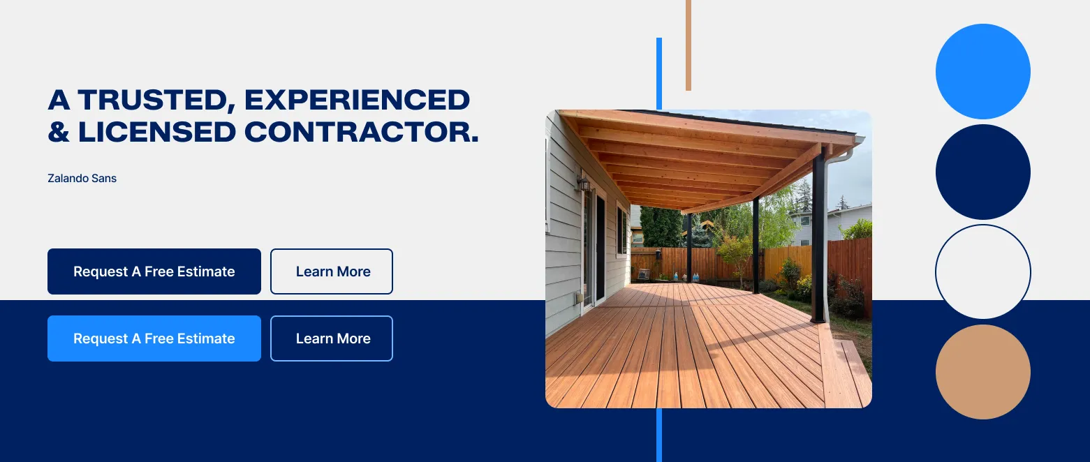
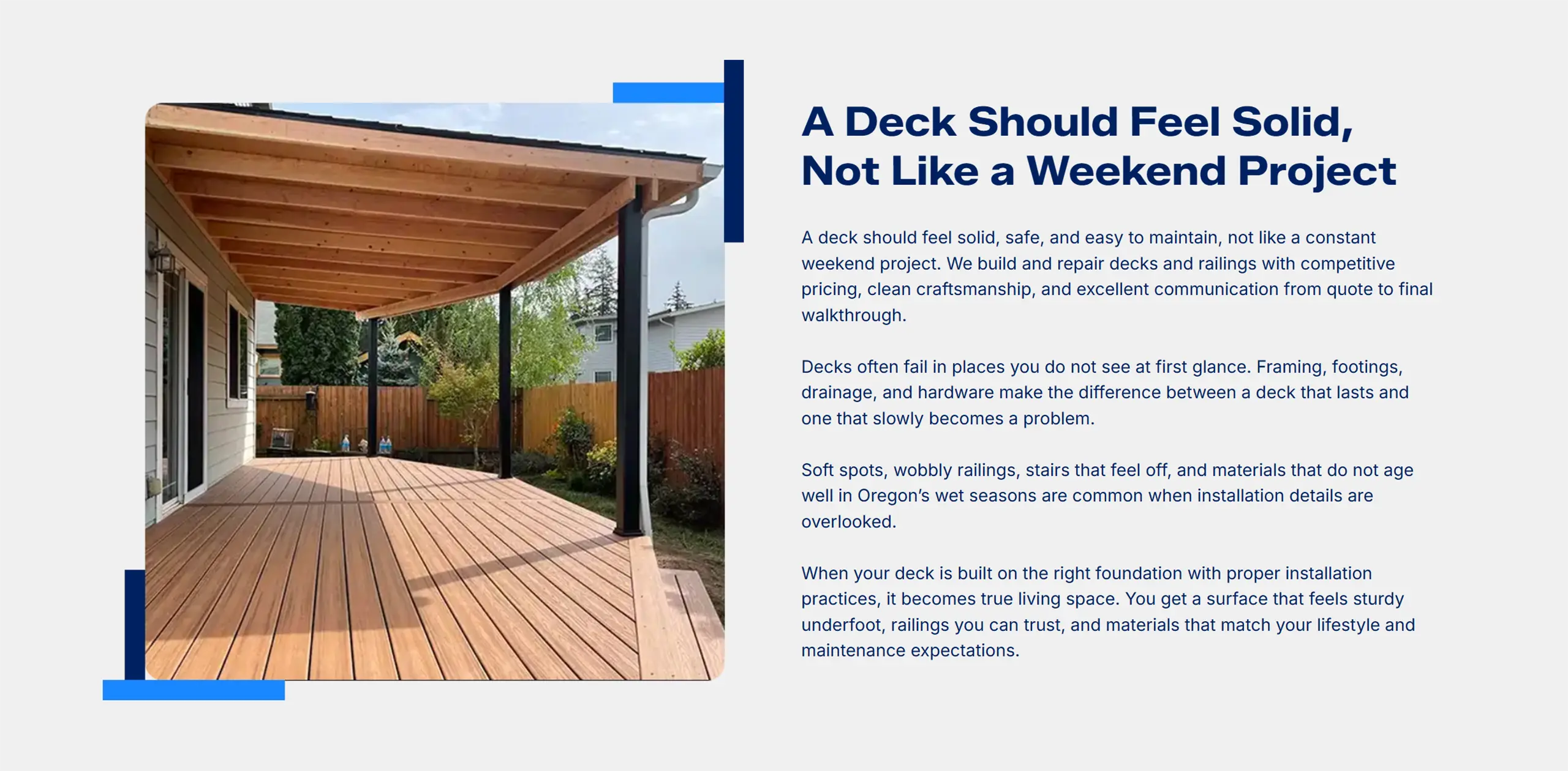
Inspired by Ben's fences and decks, we sought to bring in elements of what he does into the website and branding design. Image frame line accents cross and join like wood beams, and the wood grain pattern ties everything together.
Fence rails stack together horizontally to form the shape of an S, for Steadfast. The post at the center stands steady, while a single rail crosses at it's center point, a nod to Ben's faith.