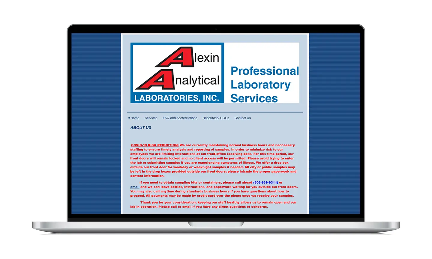
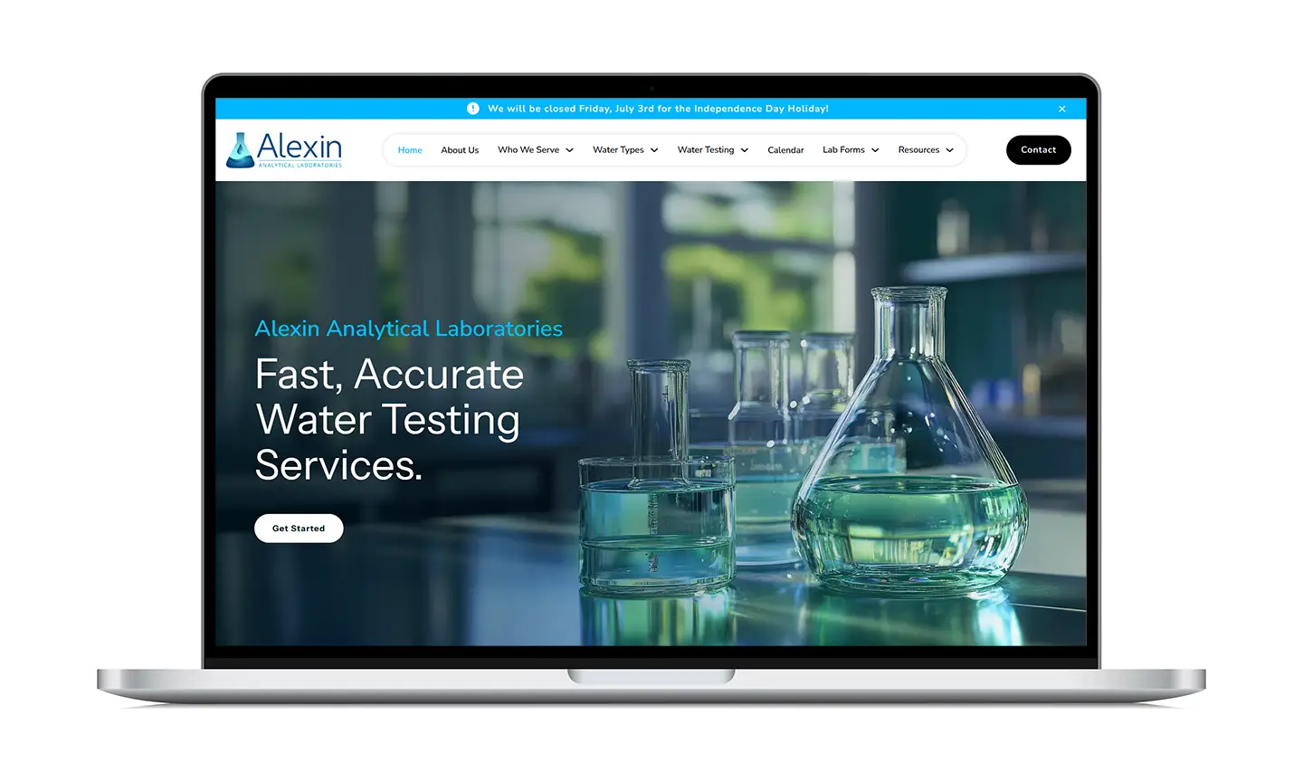
Founded nearly 50 years ago, Alexin Analytical is the longest running certified water testing lab in Oregon. During this time, their logo and branding material remained largely the same - some colors and clip art thrown together by the founder. When the torch was passed on to his son's family, the new owners wanted to modernize the business, attracting a younger workforce and rising to the more intentional branding of their newest competitors.
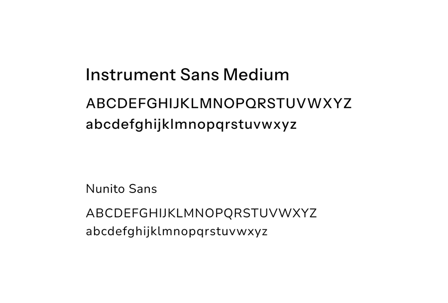
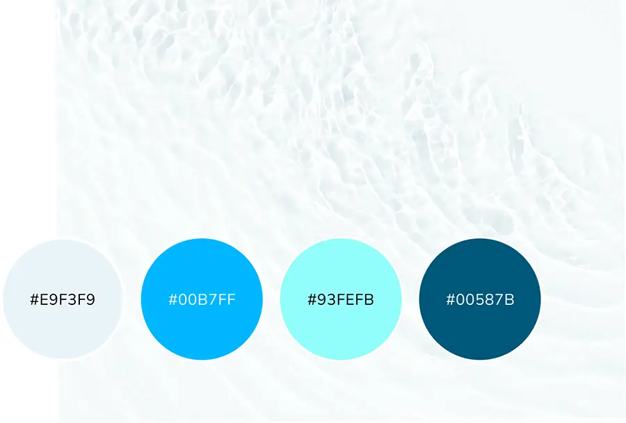
While their main objective is to provide accurate test results, we dug deeper into the minds of Alexin’s clients to determine a direction for their visual identity. This brought us to the keywords of ‘trust’, ‘chemistry’, and ‘clean’. The new visual identity conveys a sense of trust through a no-nonsense design approach that complements rather than embellishes the information at hand. The analogous blue and gray color palette conveys a sense of analytical, scientific purpose. Additionally, we knew that clients seek these testing services to ensure their water is clean - either for the safety of their family or to comply with strictly enforced government regulations. Imagery of clear water ripples and droplets shows clients what they desire. In the new website design, there is plenty of open, white space for this feeling of cleanliness. We chose the typeface Instrument Sans for its even, clear-cut letterforms that align with each of the adjectives above.
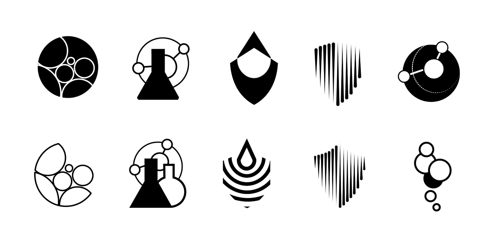
Initial logo sketches leaned on the concepts of trust and water more abstractly, with shapes that represented droplets of water forming or merging with simplified shields. I also experimented with the circular shapes water takes on when in a petri dish, and the form of an H20 molecule.
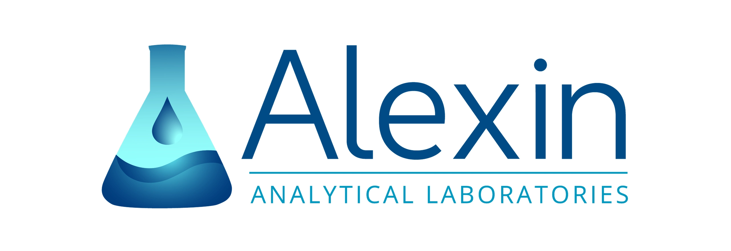
Ultimately, the Alexin team wanted a more literal representation of what they do, so that clients wouldn’t feel any confusion about the laboratory's purpose. We created a triangular beaker that echoes the letter A in Alexin, with a droplet forming two waves that curve towards the name of the business. A navy and bright blue gradient gives the water a subtle reflection and glow.
Our biggest challenge with this project was to walk the line between the sterile, efficient nature of any successful laboratory like Alexin, and the friendly approachability we knew their prospective clients and employees would seek. With the laboratory now expressing a sense of affinity with their new visual identity, as well as feeling more confident in their interactions with a younger audience, I think we’ve succeeded in this goal!